
InvoKube
Elizabeth Denton
Luxury personal brand · 2026
Built with
InvoKube
- Client
- Elizabeth Denton
- Sector
- Luxury personal brand
- Scope
- Identity · Wordmark · Brand guide
- Status
- Delivered
Scoped in a day, designed and built in weeks. One fixed price.
Summary
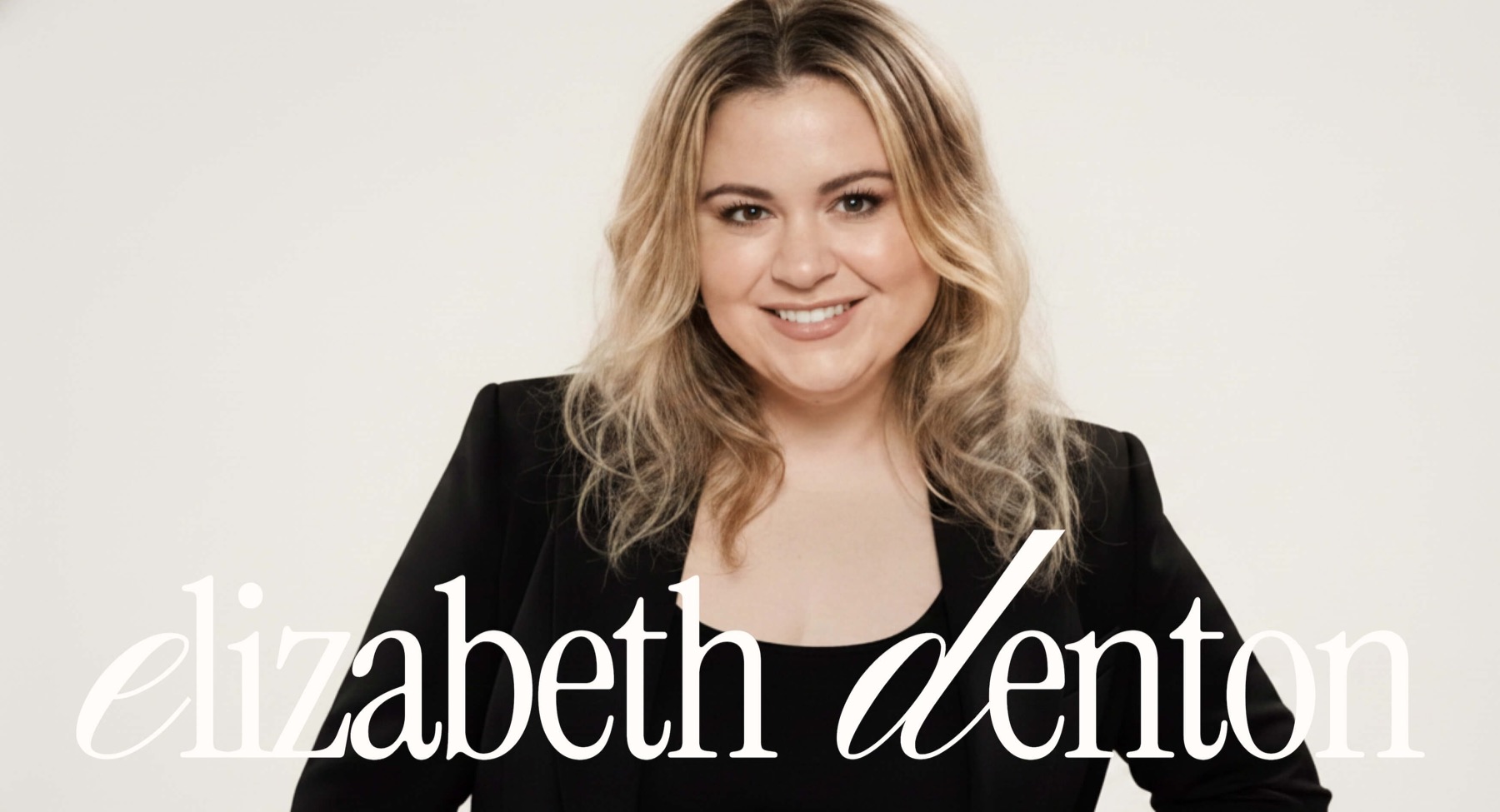
Elizabeth Denton was already working with luxury clients, but her own brand said nothing about it. We designed a wordmark and a full brand guide so everything she puts her name on reads at the level she works at. Delivered in ten days.
Overview
Elizabeth was winning luxury clients on reputation alone. Her name travelled by referral, and the work spoke for itself once people were in the room. Everything before that moment let her down: a logo set in a default typeface, no fixed palette, proposals and social posts that looked different every time. The clients were premium. The brand was not.
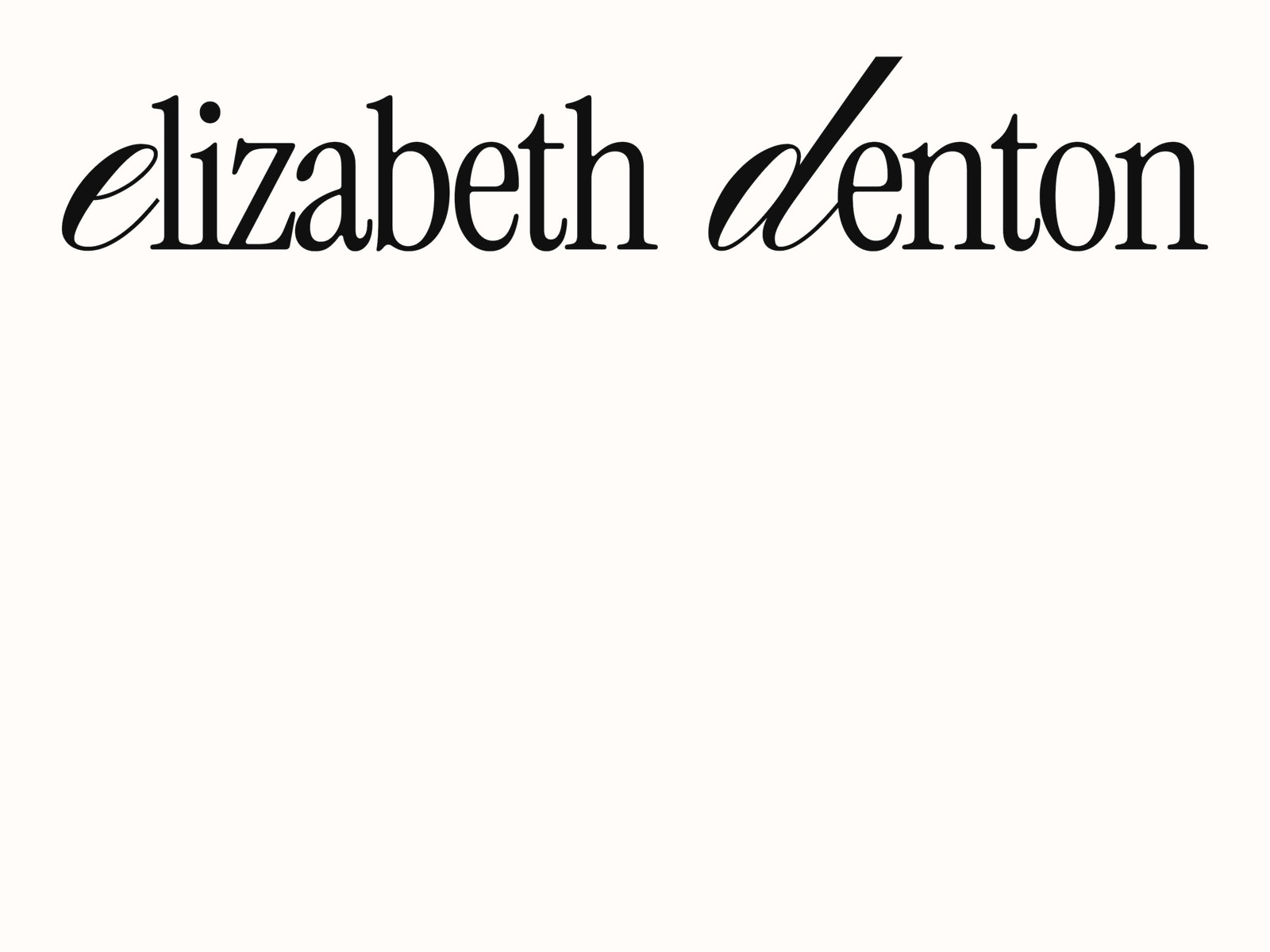
We started with the name. The wordmark sets 'elizabeth denton' in a high-contrast serif with two custom-drawn letters, a swash e and a long-stroke d, so it reads as a signature rather than a typed line. It sits alone on warm ivory, with no icon, no tagline and no colour competing with it. Restraint is the whole point.
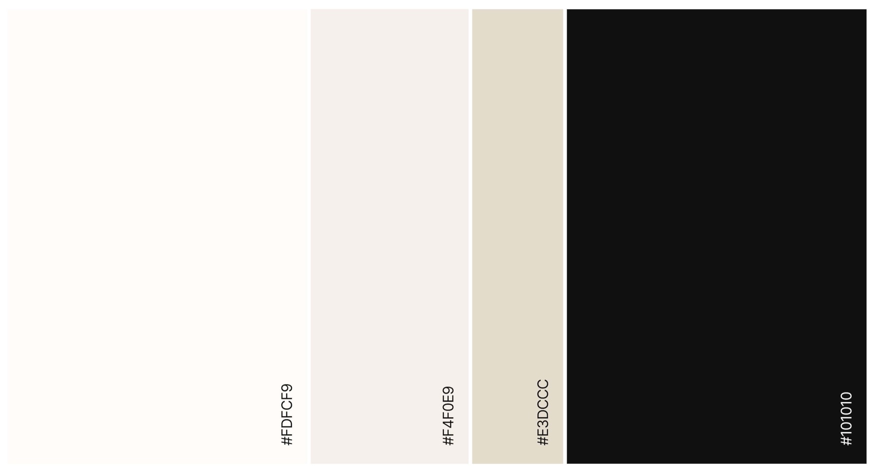
Around the wordmark we wrote the rules: a two-face type system, an ivory-and-ink palette with one accent, spacing and clear-space, how the mark sits on photography, and templates for the places her brand actually appears, from a proposal cover to an Instagram post to an email signature. Everything she sends now looks like it came from the same house.
The guide is in her hands and in use. If your clients are premium and your brand is not, they notice the gap before you do.
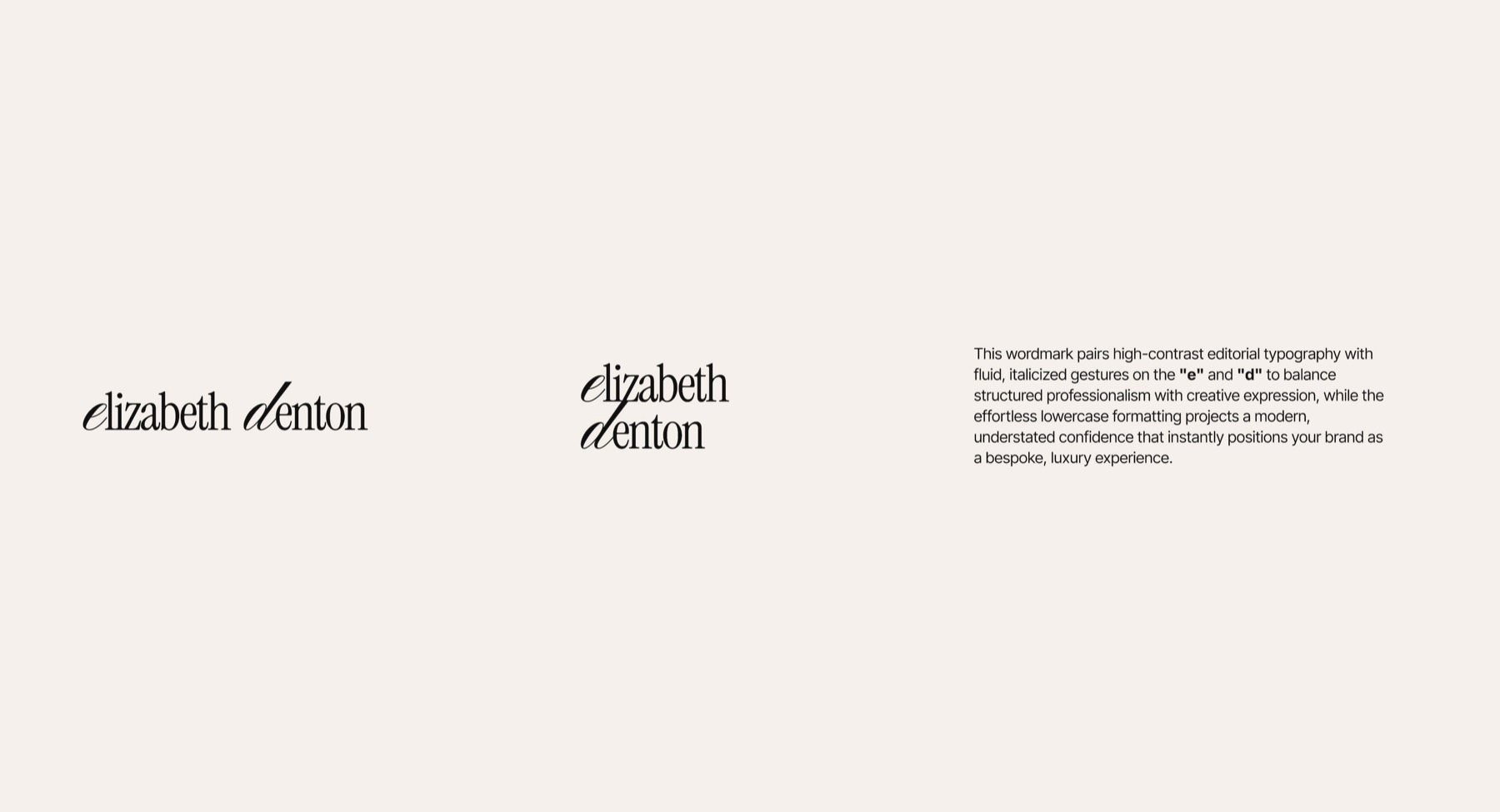
- Primary wordmark with custom letterforms
- Lockups and clear-space rules
- Type system and colour palette
- Brand guide
Related work
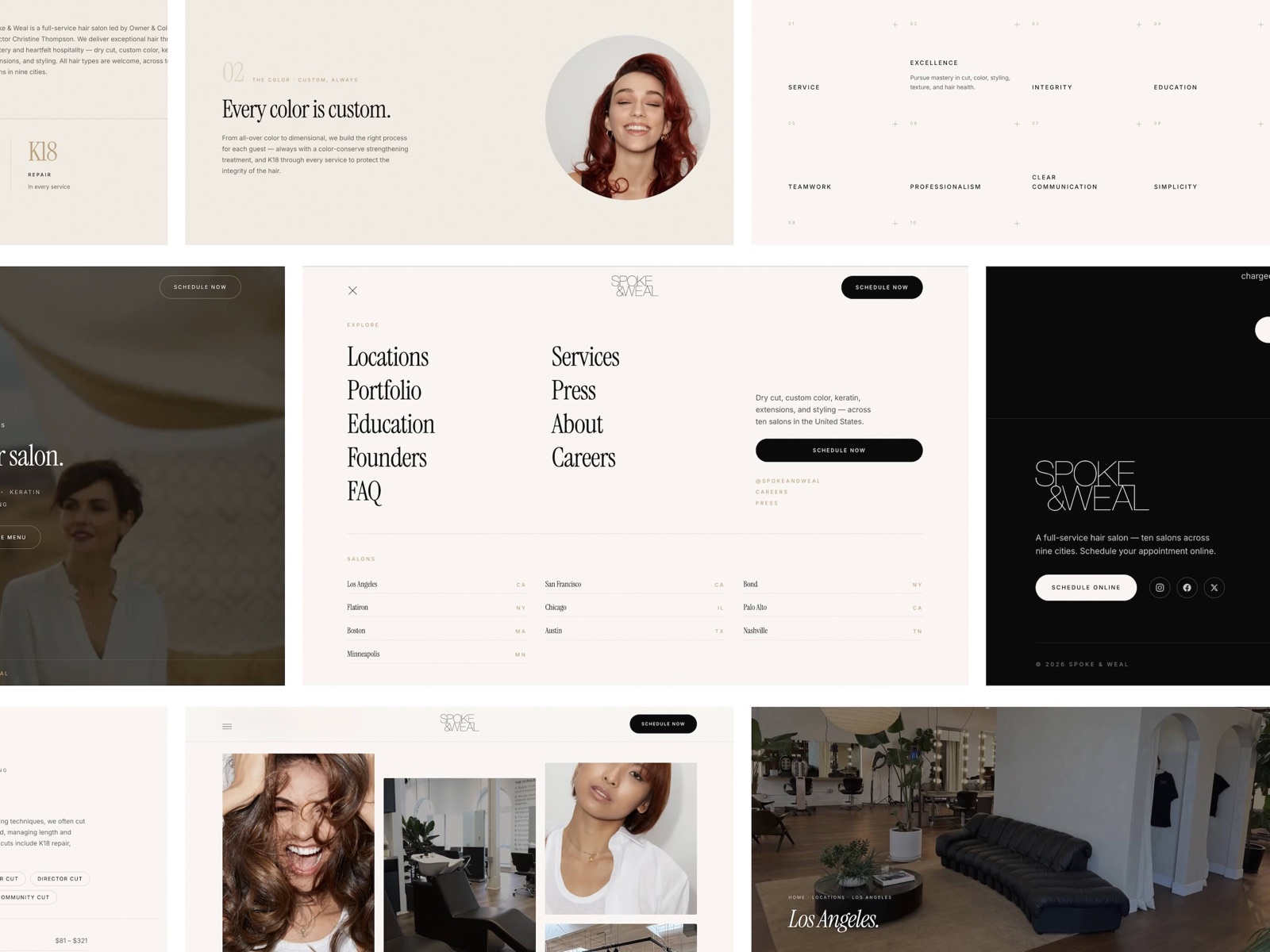
spokeandweal.com
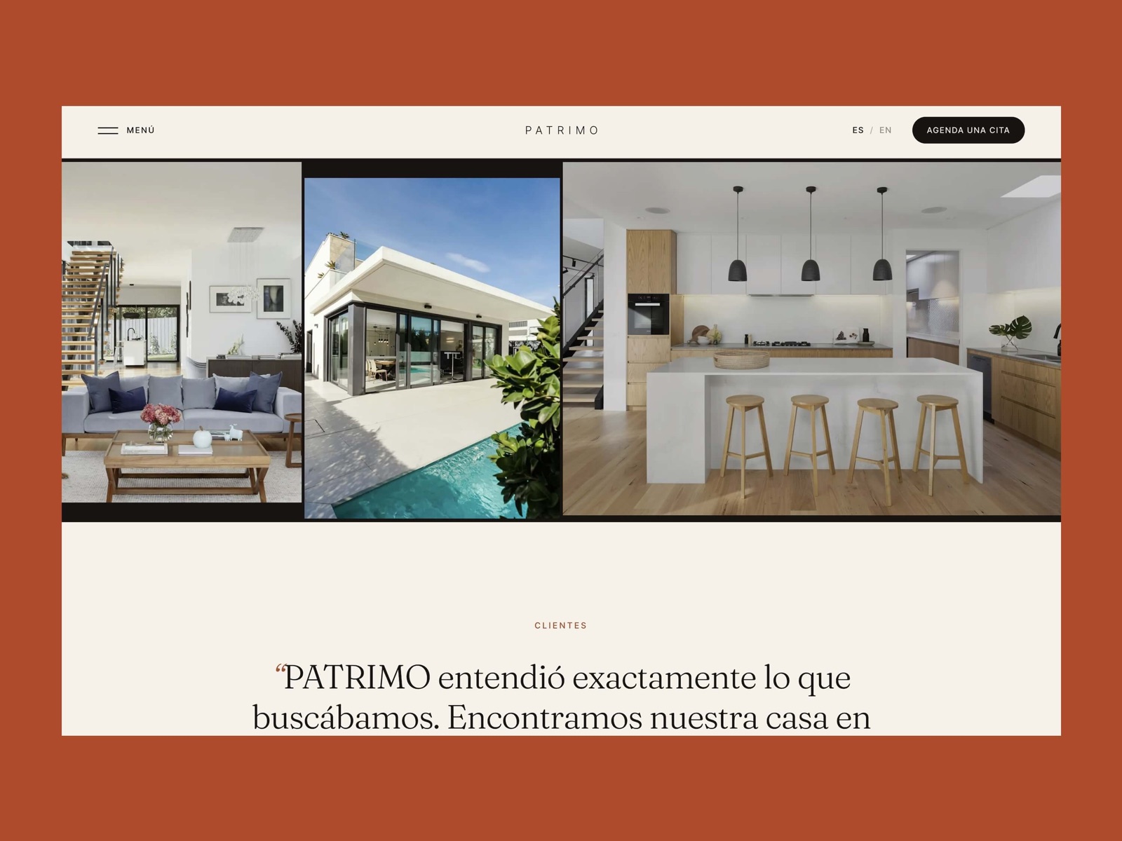
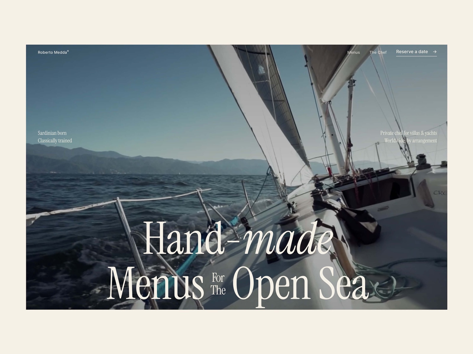
robertomedda.invokube.com
Tell us what you want to build.